
- Développement web
- Ecommerce
Développement Prestashop : Comment créer une boutique en ligne performante en 2025 ?

A CSS stylesheet is a file containing style rules applied to the HTML elements of a web page. It defines how elements appear, including layout, colors, fonts, spacing and much more. By using a CSS stylesheet, developers can separate content from presentation, making HTML code cleaner and easier to maintain.
One of the main reasons for using a CSS style sheet is to separate HTML content from presentation. This enables :
CSS style sheets reduce the size of HTML code by externalizing the style. This can improve web page loading times, as CSS files can be cached by the browser.
Clean HTML code, separated from style, is easier to interpret by search engines and screen readers, improving your site's accessibility and SEO.
CSS offers a wide range of properties and selectors, giving you precise control over the presentation of your HTML elements. You can easily adapt the design for different devices and screen sizes with media queries.
CSS preprocessors, such as Sass and LESS, add advanced features that native CSS lacks, such as variables, functions and mixins. They enable you to :
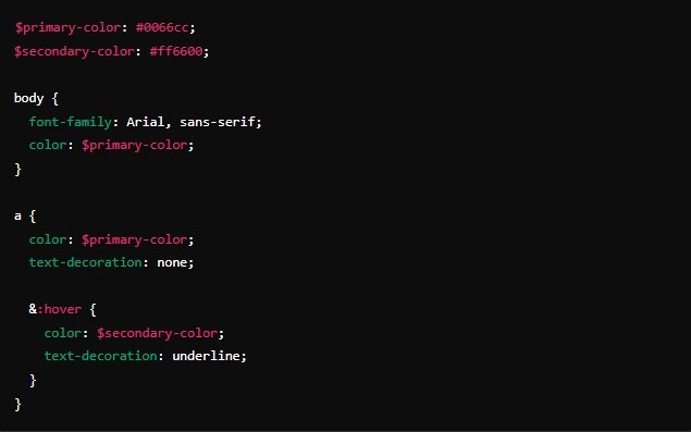
In this example, we use variables to define the main and secondary colors, making them easy to reuse and modify later.
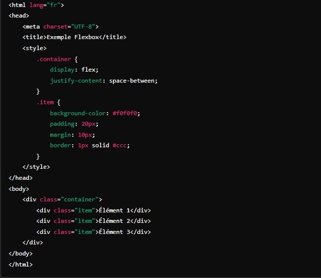
In this example, we use Flexbox to create a flexible layout. The display: flex; property on the container is used to arrange the child elements in a row.
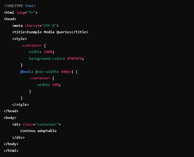
Media queries allow you to change the style according to screen size. In this example, the container width changes from 100% to 50% when the screen width reaches 600 pixels.
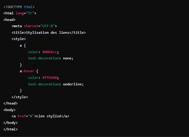
This example shows how to style links. We define a default color and no underlining, then modify these styles on hover.
Whether you need to create consistent styles for a brand, optimize page performance with efficient CSS file cache, or ensure compatibility across all devices with well-designed media queries, our team is here to support you.
Our expertise enables us to turn your ideas into visual reality, offering web design solutions that not only captivate your audience but also enhance the user experience.