
- CMS
Drupal 2025 : L’intégration de l’IA et les nouvelles fonctionnalités de gestion de contenu

The homepage of your e-commerce site is one of the most important pages and is the point of arrival for a large part of your traffic. It is therefore essential that your visitors have a good (and strong) first impression as soon as they arrive while encouraging a well- defined action. Actually, visitors will spend 10 to 20 seconds on your homepage, that’s why it is important that it is as optimized as much as possible so as not to lose its visitors.
Before optimizing your homepage, it is important to clearly identify the objectives of it, and we have identified several:
Once these objectives are well identified, several optimizations allow to keep your visitors on your site and to encourage them to go further
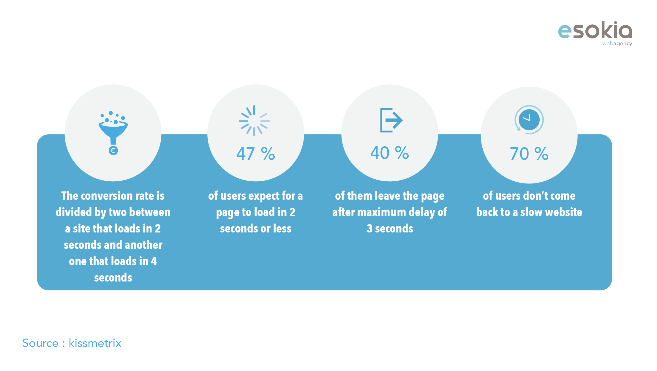
It can never be repeated enough, but a good user experience comes first through an acceptable loading time. The longer the loading time, the more visitors you will lose.
The waterline is a virtual line below which the content of an Internet page no longer appears on the screen. What is above is what visitors see, without scrolling down the page.
When choosing what to display in this section, it is important to identify the actions you would like the visitor to complete when they first land on your site, what information they would need first, and how you could make that decision easier for him.
Use a catchy headline, persuasive subtitle, and eye-catching visuals to keep visitors there longer and let them get familiar with your brand.
The action should be obvious, do not present too many details so that your visitors can correctly identify your action-to-action or call-to-action buttons and the information on your page.
Smooth and intuitive navigation
To be intuitive, the navigation on a web page must be minimalistic. This might seem contradictory when you know that you have to attract several types of visitors. But the concept makes sense when we see the speed with which the users jump today from one page to another on the internet.
The navigation menu should be simplified as much as possible. It must prioritize the navigation paths that interest a majority of visitors.
Menus with a high number of navigation tabs can mentally tire visitors, confusing them, sometimes even pushing them out of the site or making them follow an irrelevant navigation path. The goal is not to lose your visitors. A good practice to follow in terms of user experience is to rank your tabs in your menu in order of importance, from left to right, starting with the most important pages on the left.
If you offer a large number of categories and products, highlight only the most attractive choices in the home page navigation, and use a drop-down menu to create sub-navigation.
At present, more and more people are connecting and making their purchases via their phone. Each decision regarding the design of your home page should consider mobile users.
It is therefore crucial to simplify as much as possible the home page and its navigation to better orient the users by allowing them to easily access the different parts of your site. This approach will avoid the loss of your visitors and will optimize your bounce rate.
You can test the mobile version of your site via https://search.google.com/test/mobile-friendly.
By using all these optimizations you will certainly have a home page that will engage the user to go further and visit your shop.
However, the ultimate goal of e-commerce is to get the best possible conversion rate (turn visitors to your site into buyers on your site).
It is therefore necessary to know and apply the best e-commerce optimization practices to boost the conversion rate and bring it to success.
Semergi is a CRO (Conversion Rate Optimization) agency and premium partner of Esokia that helps e-commerce players to optimize their website and to maximize their conversion rates thanks to neuromarketing.
Semergi is a solution for optimization of Conversion rates or “CRO” (Conversion Rate Optimization) of an e-commerce website in order to:
For more information: https://www.semergi.com
To contact Semergi: [email protected]
To join with Semergi on social networks: